Make your calculator look like it belongs on your website — without touching code for every field. You will learn how themes, layout, default styles, and per-widget design work together, then style a realistic Submit and Cancel button pair in different colors.
What we will build
Below you can see sample form we will create in this tutorial.
This guide covers appearance only. Formulas, actions, and lead capture are out of scope.
In this tutorial
Using a sample Contact Form, you will learn how to style forms in Calcopolis:
- Start from a theme — apply an existing design to the whole calculator in one click.
- Tailor it to your brand — adjust layout, default styles, fonts, and per-widget design using the available editor options.
- Go further with custom CSS — at the end, see how to handle more advanced cases that the visual editor does not cover.
The sample form uses these widgets:
| Element | Purpose in this tutorial |
|---|---|
| Header | Page title |
| Custom Text | Short intro line |
| Text (email) | Visitor email field |
| Textarea (message) | Visitor message field |
| Button × 2 | Submit (primary) and Cancel (secondary) |
You can follow along in a new project or an existing form — the styling steps are the same.
Step 1 — Add the widgets
- Open the builder (Forms → your project, or New Form).
- On the canvas, add from the Elements sidebar:
- Content Widgets → Header — text:
Contact us - Content Widgets → Custom Text — e.g. Tell us how we can help.
- Form Widgets → Text — Label:
Email(any Name is fine) - Form Widgets → Textarea — Label:
Message - Form Widgets → Button — Button Text:
Submit -
Form Widgets → Button — Button Text:
Cancel -
Optional but practical: place the two buttons side by side.
- Containers → 2 columns
- Drag each Button into its own column.
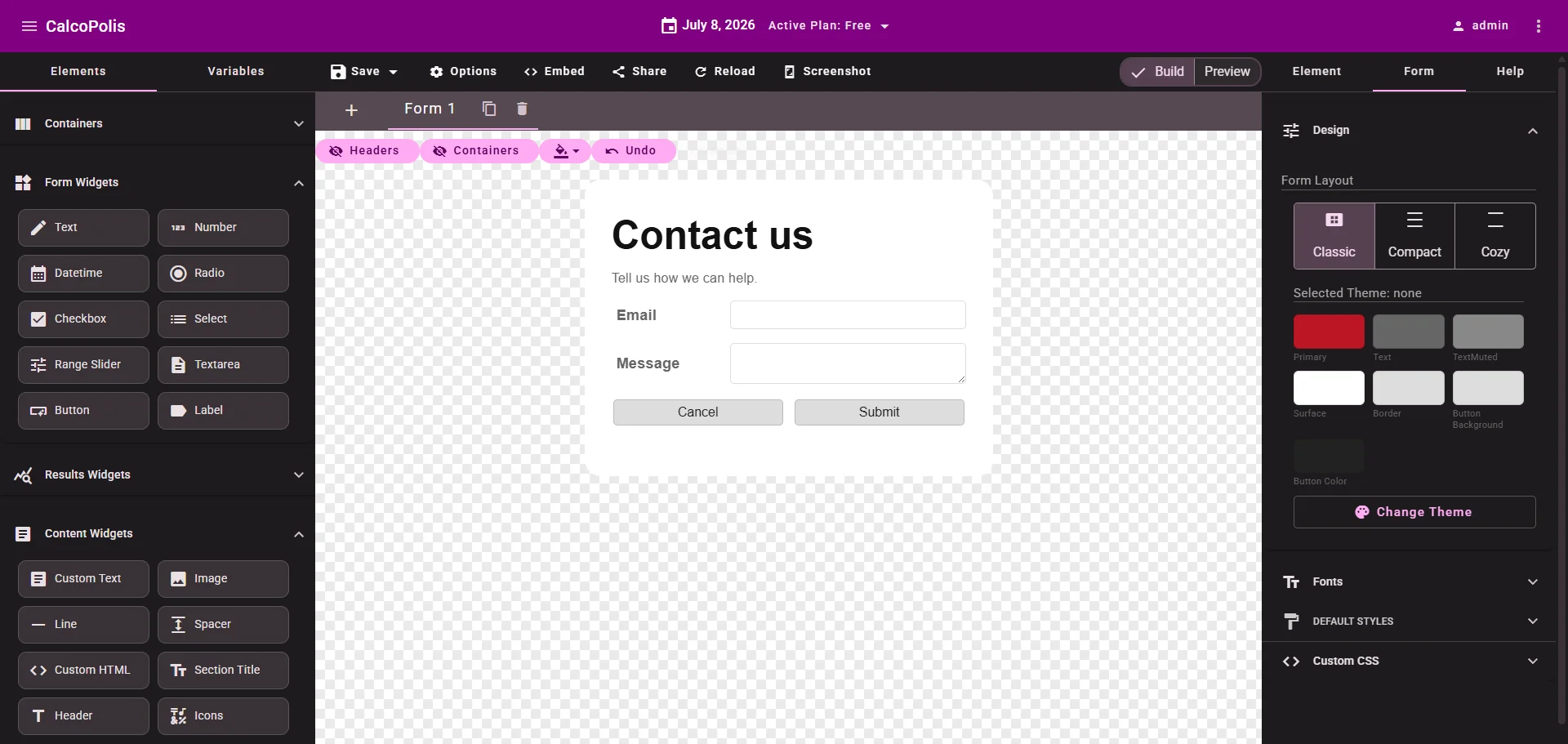 Figure 1 — A minimal layout to practice styling
Step 2 — Pick a theme
A theme sets the overall look: colors, borders, typography defaults, and button styling for the whole calculator.
- Open the Form tab in the right sidebar (project-level settings — not the Element tab for a single widget).
- Expand Design.
- Click Change Theme.
- Browse the gallery, open a preview, and click Select.
The active theme name and color swatches appear under Selected Theme. Every widget inherits this look until you override something locally.
Note: This guide uses existing themes from the gallery only. Creating or editing theme files is not covered here — pick the closest match, then fine-tune with Default Styles and per-widget Design.
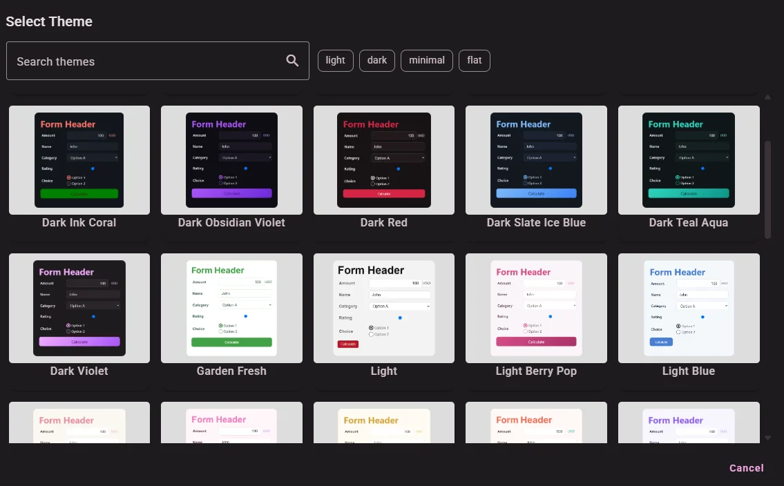
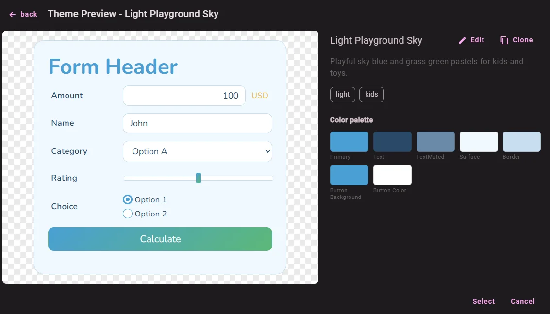
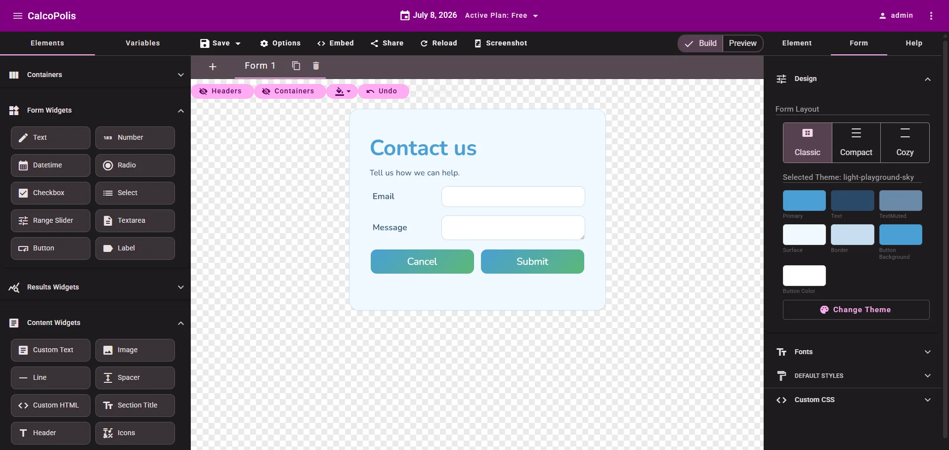 Figure 2 — One theme restyles the entire calculator
Step 3 — Choose Form Layout
Still under Form → Design, use Form Layout:
| Layout | When to use it |
|---|---|
| Classic | Balanced spacing — good default for most calculators |
| Compact | Tighter vertical spacing — more content above the fold |
| Cozy | More breathing room between widgets |
Click each option and watch the canvas update. Layout affects spacing across the whole form; it does not change your theme colors.
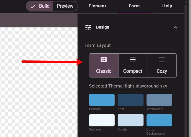
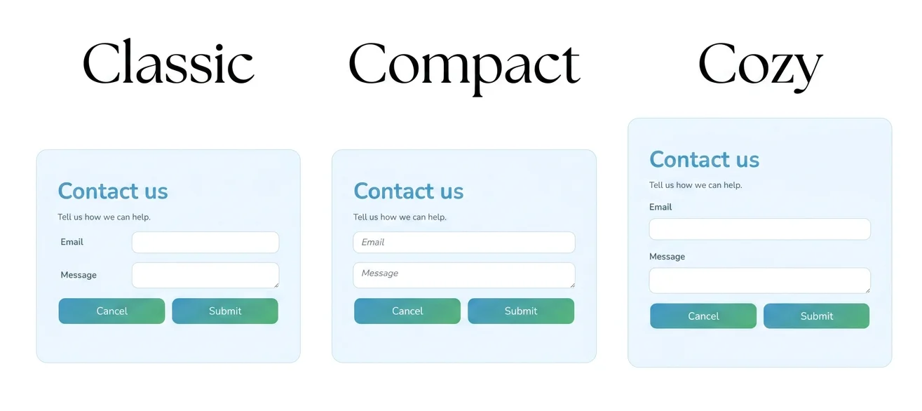 Figure 3 — Layout controls density, not brand colors
Step 4 — Adjust global Default Styles
Default Styles on the Form tab set project-wide baselines. Individual widgets can still override them.
Expand Default Styles:
Form
Styles the calculator container — background, padding, border, max width, and similar properties for the whole form area.
Example uses:
- Slightly larger Padding so content does not touch the card edge
- Background tweak if the theme card feels too flat
Widget defaults
Styles that apply to every widget unless a widget has its own Design settings — commonly Label font size and default Control colors.
Example uses:
- Set Font Size on Label once instead of editing each field
- Set a default Background on Control for all inputs
Leave a field empty to keep the theme’s value (placeholders show default value).
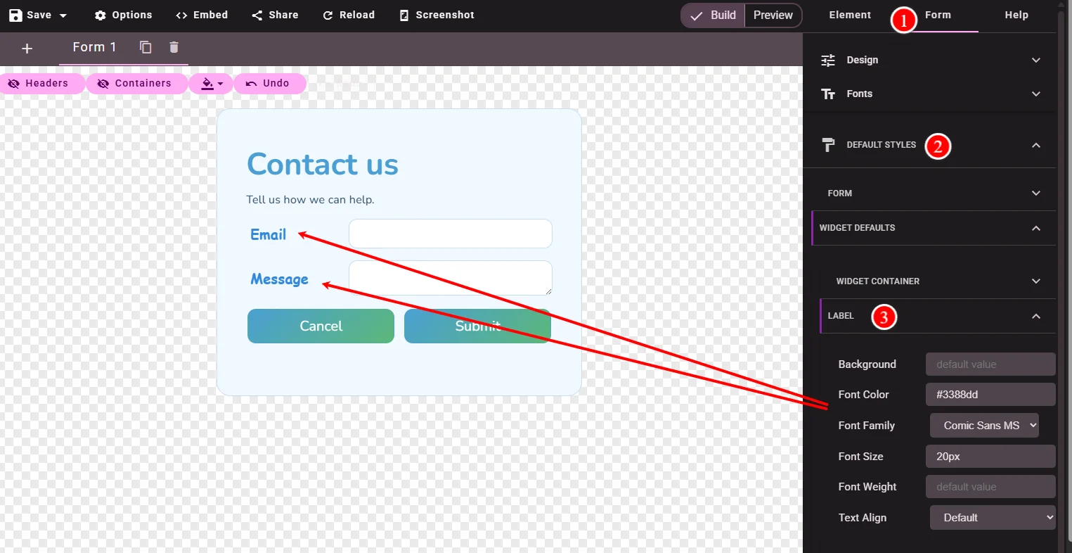 Figure 4 — Global baselines before per-widget tweaks
Step 5 — Style an individual widget
Global defaults are efficient; some widgets need their own look. Select any widget on the canvas, then open the Element tab.
Expand Design. You will see:
- A short diagram — each widget is built from a container, optional Label, and inner parts.
- Style sections — names depend on the widget type.
Shared parts (most inputs)
Widgets like Number, Text, and Select typically include:
| Part | What it is |
|---|---|
| Widget Container | Outer box around the whole widget |
| Label | Text above the field |
| Control Area | Wrapper around the input |
| Control | The input itself |
Change Background or Font Color on Control to style one field differently from the rest.
Widget-specific parts
Some widgets add extra parts. For example Range Slider also exposes Track, Slider Handle, Ticks, and Value — so you can style the slider rail separately from the handle.
Each widget’s Reference article lists its parts and useful CSS selectors. See Number vs Range Slider for comparison.
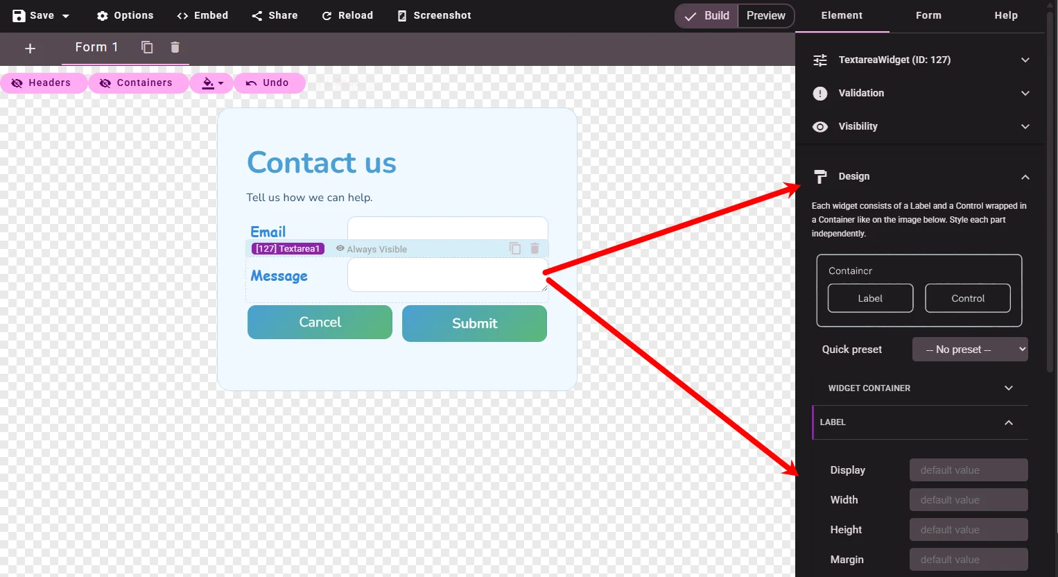 Figure 5 — Shared parts on inputs; sliders add their own
Step 6 — Use a Quick preset (Button)
Button widgets include Quick preset — one-click starting points for size and weight.
- Select a Button.
- Element → Design → Quick preset.
- Try Large Button, Medium Button, or Small Button.
Presets adjust width, padding, and font size on the Button part. They are a fast first step; you can still change colors afterward.
Apply Medium Button to Submit and Small Button to Cancel if you want a clear visual hierarchy before custom colors.
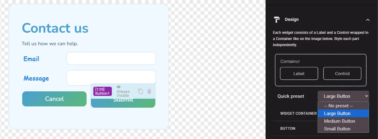 Figure 6 — Presets jump-start button sizing
Step 7 — Add custom fonts
To use a brand font beyond the theme default:
- Open the Form tab → expand Fonts.
- Click Add Google Font and pick a family from the catalog.
- Assign the font in Default Styles or in a widget’s Design → Font Family on the relevant part.
Fonts you add here appear in Font Family dropdowns throughout the style editors.
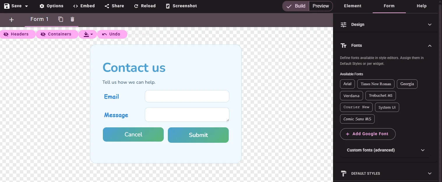 Figure 7 — Add fonts once, use them in Default Styles and widgets
Add fonts from another server
If the Google Font catalog is not enough, you can link a font hosted on your own server, a CDN, or any public stylesheet.
- Still on Form → Fonts, expand Custom fonts (advanced).
- Fill in the fields:
| Field | What to enter |
|---|---|
| Label | A friendly name shown in Font Family dropdowns — e.g. Brand Sans. If you leave it empty, the Font family (CSS) value is used. |
| Font family (CSS) | The exact CSS font-family name from your stylesheet — e.g. "Acme Brand", sans-serif. This field is required. |
| Stylesheet URL (optional) | The full https://… URL to the CSS file that loads the font (typically a file with @font-face rules). Calcopolis injects this stylesheet into the published calculator. |
- Click Add custom font.
The font appears as a chip in the Custom fonts (advanced) section. You can remove it later with the × on the chip.
- Open Default Styles or a widget’s Design → pick your new font from Font Family.
Example — a font file hosted on your site:
| Field | Value |
|---|---|
| Label | Brand Sans |
| Font family (CSS) | "Brand Sans", sans-serif |
| Stylesheet URL (optional) | https://www.example.com/fonts/brand-sans.css |
Your brand-sans.css should define @font-face with font-family: "Brand Sans" matching the value above.
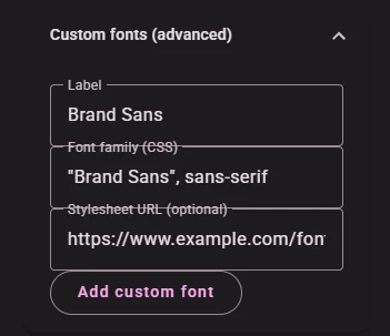 Figure 7b — Link a font from your own server or CDN
Step 8 — Style Submit and Cancel in different colors
Now the practical case: two buttons on the same form, each with its own color — using the Design panel only.
Submit (primary)
- Select the Submit button.
- Element → Design → expand Button.
- Set Background to your brand green (e.g.
#16a34a). - Set Font Color to
#ffffff. - Optional: Border Radius
8pxfor rounded corners.
Cancel (secondary)
- Select the Cancel button.
- Design → Button.
- Set Background to
transparentor a light gray. - Set Font Color to a muted tone (e.g.
#555555). - Set Border (e.g.
1px solid #cccccc) if you want an outline button.
Save draft and switch to Preview and confirm both buttons read clearly against the form background.
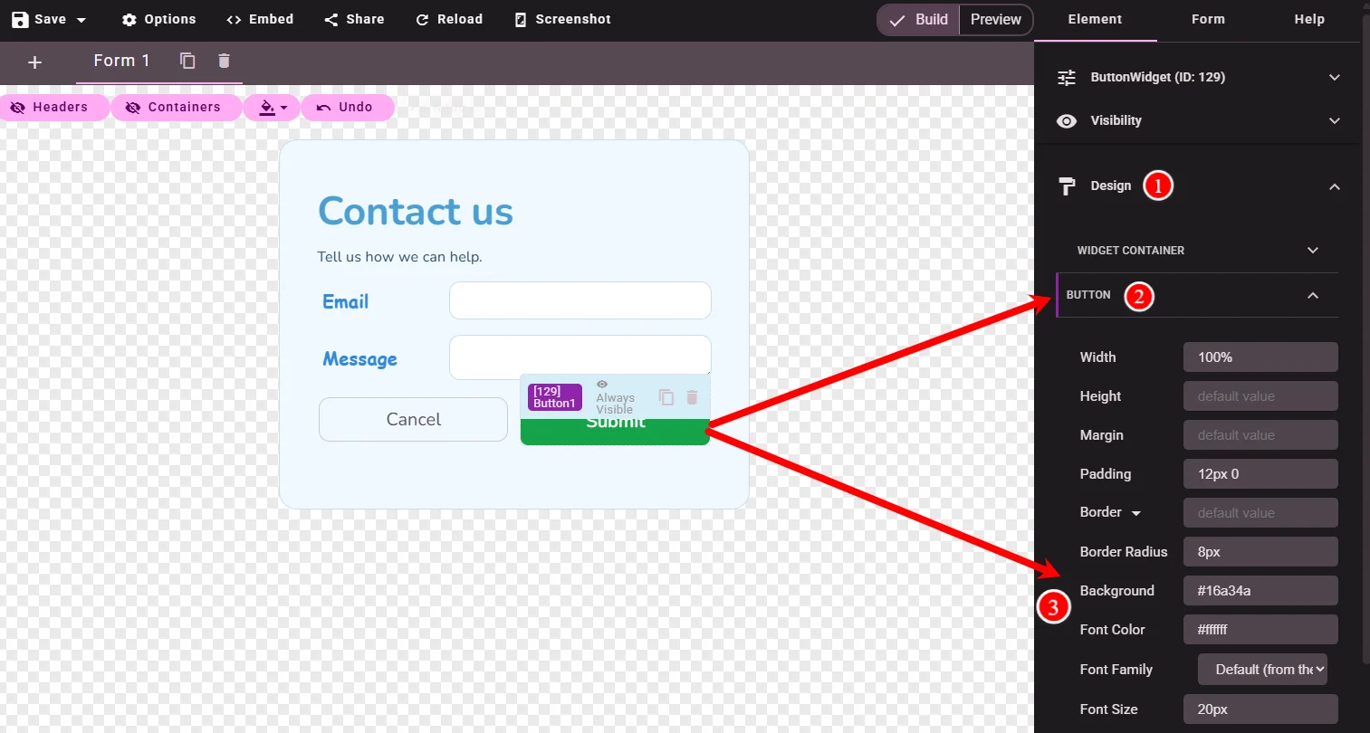 Figure 8 — Per-widget Design overrides theme defaults per button
Step 9 — Custom CSS for advanced cases
The visual editor covers most needs — you already colored both buttons through Design, no CSS required. Reach for Custom CSS only when you want something the editor does not expose, such as hover and focus effects, animations, or responsive tweaks.
Here we add a subtle focus highlight on the Email and Message fields — a pseudo-class (:focus) that the visual editor cannot set.
Widget IDs and Custom CSS Classes
You can target widgets in two ways:
- Widget ID — when a widget is selected, the Element panel title shows its type and ID, e.g.
Text (ID: 142). On the live form that widget’s outer container uses the id#cp-142, so you can target exactly one widget. - Custom CSS Classes — on any widget → Design → Custom CSS Classes, add space-separated class names (e.g.
contact-field). The class is applied to the widget’s outer container (the same element as#cp-{ID}), which lets you style several widgets with one rule.
Each widget’s Reference article lists useful selectors and the input classes it renders. See the Number and Textarea references.
Add the class
Select the Email widget → Design → Custom CSS Classes → type contact-field. Repeat for the Message widget.
Add the rule in project Custom CSS
Open the Form tab → expand Custom CSS and add:
.contact-field textarea {
   height: 80px;
}
.contact-field input:focus,
.contact-field textarea:focus {
  outline: none;
  border-color: #2563eb;
  box-shadow: 0 0 0 3px rgba(37, 99, 235, 0.2);
}
Now both fields glow blue when the visitor clicks into them — an interaction effect that lives only in CSS.
This example is intentionally small, just to show custom CSS is available. Advanced layouts, media queries, and complex overrides are beyond this guide.
Use Preview after saving and click into each field to test the focus state. Incorrect CSS can affect layout, so keep a Save Draft before experimenting.
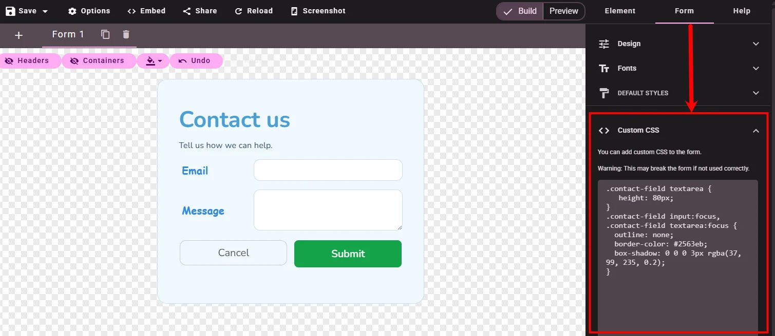 Figure 9 — Custom CSS handles what the editor cannot: a :focus highlight
Step 10 — Preview and save
- Toggle Preview and check desktop appearance.
- Return to Build, click Save → Save Draft (or Save & Publish when ready).
Your theme + layout + defaults + per-widget styles are stored with the project.
What you learned
- Themes — pick an existing gallery theme for the whole calculator
- Form Layout — Classic, Compact, or Cozy spacing
- Default Styles — global Form and Widget defaults on the Form tab
- Design per widget — shared parts (Label, Control, …) and widget-specific parts (e.g. slider Track)
- Quick preset — fast button sizing
- Fonts — Google Fonts and custom font families
- Submit vs Cancel — different colors via per-widget Design
- Custom CSS for advanced cases the editor cannot reach (e.g. a
:focushighlight), via Custom CSS Classes and#cp-{ID}
Troubleshooting
| Problem | What to check |
|---|---|
| Theme change not visible | Confirm you clicked Select in the theme dialog. Save and refresh Preview. |
| Widget ignores Default Styles | That widget may have local Design values — clear the field to inherit default value again. |
| Both buttons look the same | Styles are per widget — select Submit and Cancel separately. |
| Custom CSS has no effect | Classes go on the widget container; style inner elements (e.g. button) as needed. Check spelling. |
| Font not listed | Add it under Form → Fonts first, then pick it in Font Family. |
Next steps
- Building Your First Calculator — full project flow including a theme in context
- Button — button parts and CSS selectors
- Number — input widget parts and Custom CSS
- Range Slider — example of widget-specific style parts